In-person markets & events · Now onboarding hosts
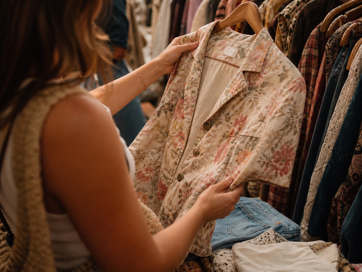
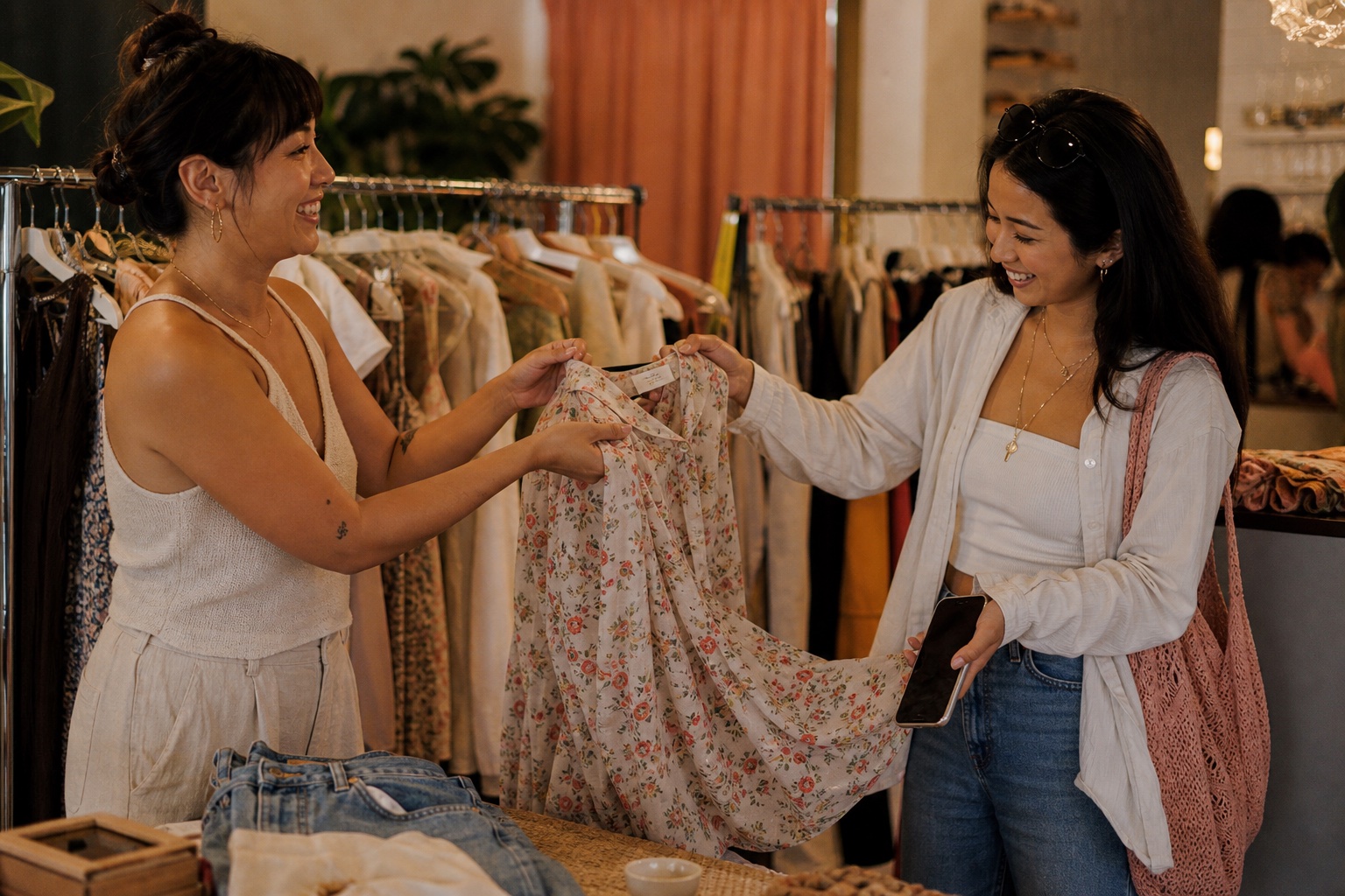
Sell where the people are
CIRCA Everything
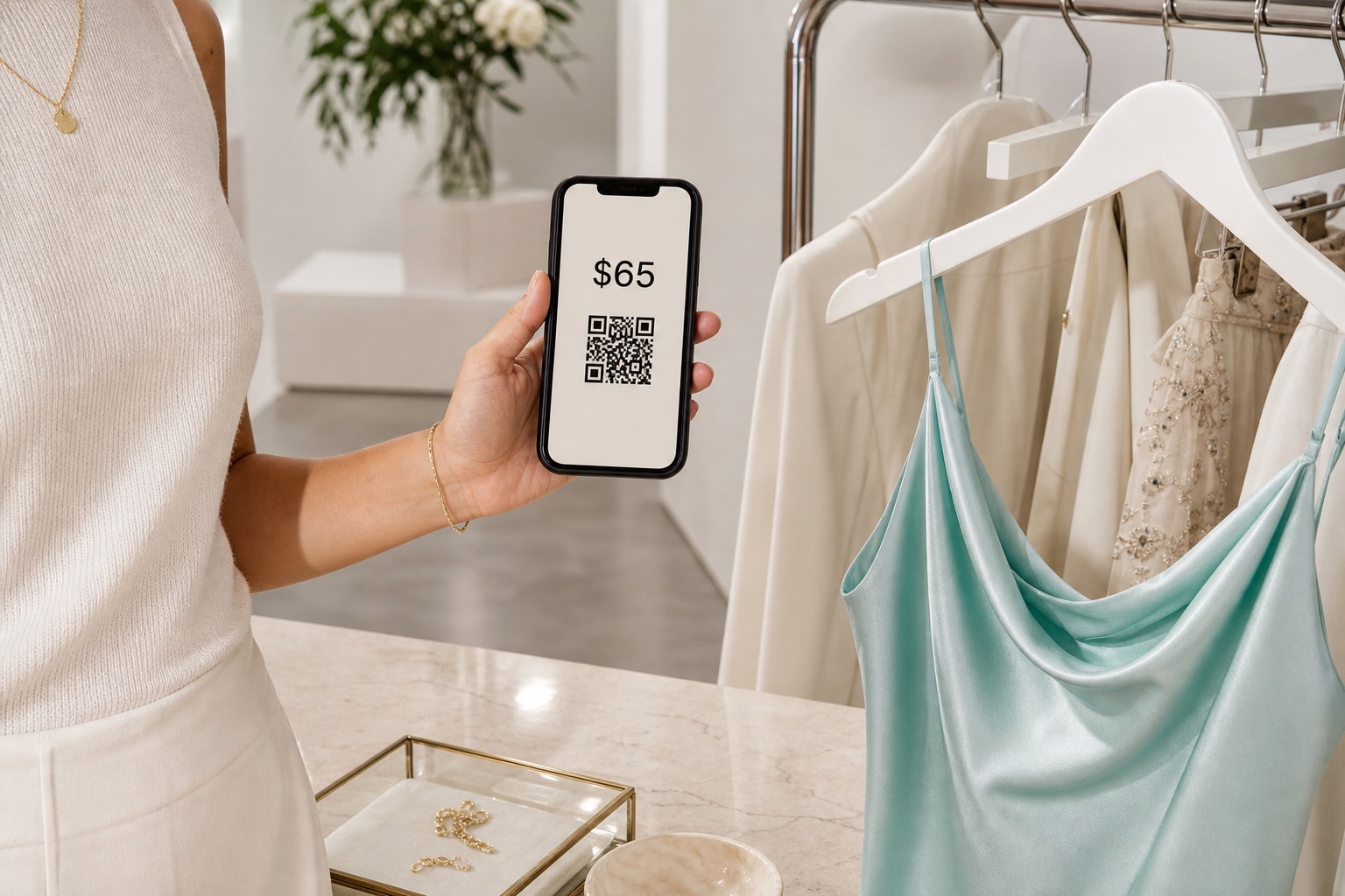
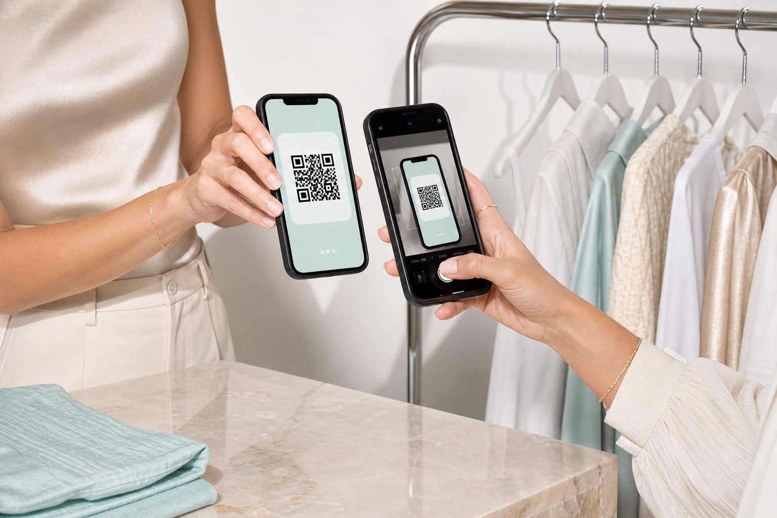
Set up once.
Sell wherever you
show up.
Add your products and get a storefront you can share. Sell in person with QR checkout. Hosts run the market from one screen.